SE CASC Research Team Develops Climate Visualization Platform
Former Global Change Fellow, Corey Davis was lead author and SE CASC USGS Deputy Director, Ryan Boyles, SE CASC Consortium PI, Karen McNeal, and Former Global Change Fellows, Lindsay Maudlin and Rachel Atkins, co-authored a new publication in Weather Climate and Society, Visually Communicating Future Climate in a Web Environment. The following post was written by SE CASC Science Communications Specialist, Ashlyn Shore.
A group of SE CASC researchers created an online climate futures visualization platform to aid forestry professionals in their decision making about resource management in a changing climate. The PINEMAP Decision Support System (DSS) hosts a suite of tools that use climate data to explore the relationships between pine trees and climate in the southeastern US.
“While there are many climate datasets and several tools to view climate projections, there have been almost no studies that explore how users actually interpret and understand these visualizations,” said Ryan Boyles, corresponding author and SE CASC USGS Deputy Director. “We wanted to specifically design and test a set of web tools and graphics that would foster improved access, use, and interpretation of climate projections by actual users making actual planning decisions.”
Visualization tools are helpful to increase understanding of current and future projections of climate change and its impacts, but these geographic layouts can easily be misinterpreted. It is important that natural resource professionals be equipped with the tools and data necessary to make decisions, and an accurate understanding of that information is imperative. It has become increasingly clear that stakeholders face challenges in accessing, analyzing, and interpreting such data and therefore, this information and the uncertainties presented within can be distorted. A team of SE CASC researchers sought to address these limitations and better understand how a group of resource professionals engage with and interpret graphics of climate projections by implementing usability testing and eye-tracking engagement techniques.
This study surveyed Southeast forestry professionals, revealing a substantial need for climate tools that emphasize reducing risk, incorporating uncertainty into decision making, and managing for resilience from future impacts to aid in forestry management. The PINEMAP Decision Support System was developed for this target audience.
Projections of future climate conditions were calculated by using MACA, a downscaling process that utilized daily meteorological variables including wind speed, specific humidity, solar radiation, minimum/maximum temperature, and precipitation metrics, to provide local information across a 6km resolution for Representative Concentration Pathways 4.5 and 8.5 (a stabilizing greenhouse gas [GHG] scenario and high GHG emission scenario). Additionally, the MACA method was applied across 20 Global Climate Models (GCMs).
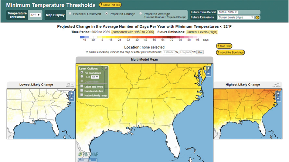
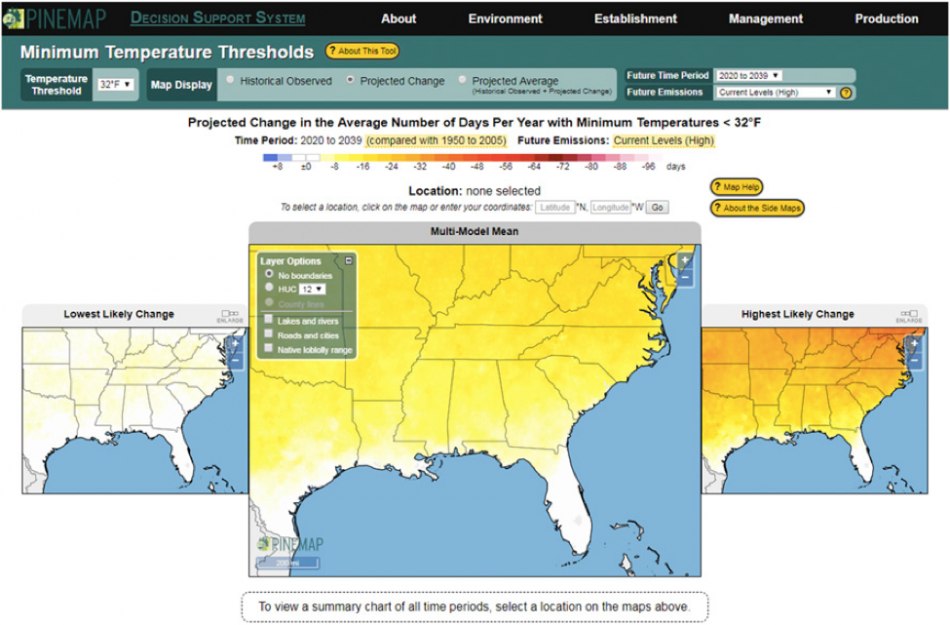
The original visualizations attempted to indicate changes in summer average temperature and precipitation, winter extreme minimum temperatures, shift in plant hardiness zones, and changes in summer drying index (the ratio of summertime growing degree-days to summer precipitation). These metrics would help professional foresters assess climate risks and opportunities related to loblolly pine tree planting and growth. Because these metrics needed to be presented across a broad range of geographic extents across the Southeast, researchers chose to design two separate displays depicting both a regional and local scale.
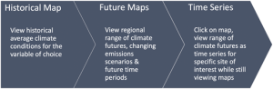
To portray three types of climate analyses represented in the platform, the user is prompted through a progression of three steps in the DSS – historical average, projected change, and projected average.
In climate visualizations, properly communicating the model error is important to depict how well the downscaled GCMs performed, especially when decisions are being made based on this information. Researchers chose to grey out the areas in which the magnitude of model error exceeded the projection. Upon completion of user testing later in the study, it was decided to not implement the model error metrics due to difficulties in interpretation.
A group of stakeholders that included forestry researchers and practitioners then completed usability tests, which assessed whether the map and time series displays were effective in communicating climate change scenarios. These results suggested that a single map view does not provide enough information for users to understand a range of future outcomes. Thus, researchers develop a three-map view that shows each scenario side by side with the multi-model mean in the center. Careful consideration of the map size was important to ensuring that users could easily and accessibly view map elements. The design shown below with the magnified center map was eventually adopted. The side maps become amplified when the user clicks on those images.
Of course a range of outcomes is possible for each of these map locations, so a time series plot was necessary to include in the visualizations. Beta testing indicated that the design shown below was best interpreted by the users.
Finally, 30 volunteers, not including the beta-testers, participated in an exploratory eye-tracking study. This allowed researchers to better understand user attention when using the DSS platform, specifically by measuring gaze duration and eye location. Heat maps were created that indicated where users looked for the longest amount of time. From this information researchers were also able to gather where users were not looking. This insight allowed them to make features easier to locate and to improve the overall design of the DSS platform.
Communicating climate projections in a visual format is a tedious process that requires intentional decisions about the data informing the visualizations and the way in which that information is portrayed. Identifying the needs of professional foresters and gathering their input throughout the development of the DSS platform aided researchers in advancing the design and function of this visualization tool. Encouraging user feedback and embracing this iterative process ultimately allowed researchers to create a resource that achieved successful interpretation of climate risk for forestry professionals in the Southeast.
Boyles added that “we hope these insights, process, and the resulting graphical design elements are useful and usable for the next generation of climate data decision tools.”
“Visually Communicating Future Climate in a Web Environment”
Authors: Corey Davis (State Climate Office of North Carolina, North Carolina State University ), Heather Aldridge (State Climate Office of North Carolina, North Carolina State University), Ryan Boyles (USGS Southeast Climate Adaptation Science Center), Karen S. McNeal (Department of Geosciences, Auburn University), Lindsay Maudlin (Department of Geosciences, Auburn University), and Rachel Atkins (Department of Marine, Earth, and Atmospheric Sciences, North Carolina State University)
Published: Oct. 15; Weather, Climate and Society
DOI: 10.1175/WCAS-D-19-0152.1
Abstract: While there is growing demand for use of climate model projections to understand the potential impacts of future climate on resources, there is a lack of effective visuals that convey the range of possible climates across spatial scales and with uncertainties that potential users need to inform their impact assessments and studies. We use usability testing including eye tracking to explore how a group of resource professionals (foresters) interpret and understand a series of graphical representations of future climate change, housed within a web-based decision support system (DSS), that address limitations identified in other tools. We find that a three-map layout effectively communicates the spread of future climate projections spatially, that location-specific information is effectively communicated if depicted both spatially on a map and temporally on a time series plot, and that model error metrics may be useful for communicating uncertainty and in demonstrating the utility of these future climate datasets.
- Categories: